I've worked with people that were more concerned with the packaging of content than the content itself. In many situations, painstaking effort was put into the font of a short film's opening titles while the character development in the story was overlooked.
The old phrase has been beaten into a cliché: Don't judge a book by its cover.
More than one person has advised me not to create a fancy logo for my reel. To keep things simple. When it comes to editing, people care about the edits you have to show, not your mastery of blend modes and gradients.
Still, having a personal logo has helped create a stamp of identity for the projects I've done so far. Plus, it's just fun to play in Illustrator sometimes.
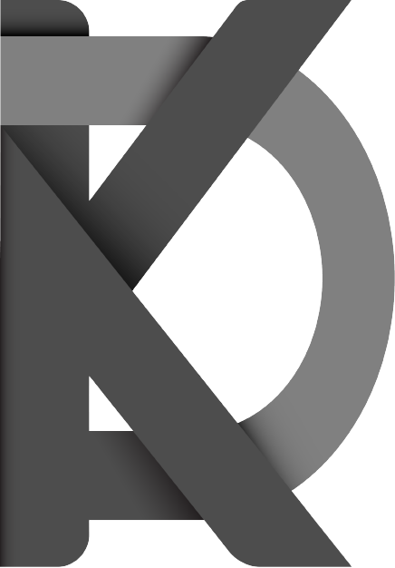
The first iteration made out of my initials, K.D.A. I was very new to Illustrator when I made this, stumbling through the process with Google as my guide. Eventually I rasterized everything without knowing the consequences of my actions.
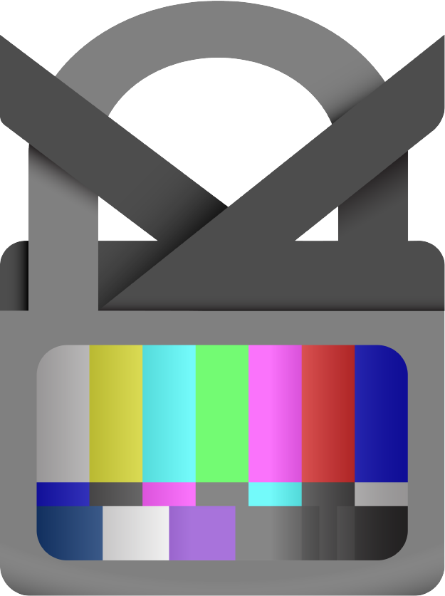
A variation with television / lock imagery. I had an animation in mind where the "lock" would close and the bars would transition into my reel. This idea has since been laid aside.